Rebranding everything I publish in eight days, with Claude and a private repo
My website, tool docs, Storybooks, slides, READMEs and social accounts now share one identity. How a private branding repository, a written backlog and Claude as a design partner got it done on spare time.
For years, everything I published looked like it came from a different person. deramond.dev was Klein Blue on white. Each tool’s docs site had whatever the framework gave me that day. Open {re}Source ran on Starlight with its own look. My talks, my README headers, my LinkedIn banner, my Bluesky avatar: all made at different times, with different fonts, for different moods.
I work on design systems for a living. I know exactly what that situation is called in a company: no design system. And I know what it costs to fix, because fixing it is my job.
The problem is time. What’s left after my day job goes to open source, mostly Bootstrap, and to the tools I maintain. Spending weeks of evenings on my own branding was never going to happen.
So I tried something different: I treated my personal brand like a design system product, kept it in one private repository, and worked through it step by step with Claude (Claude Code). It took eight days. This post is how it worked, what came out of it, and where it falls short.
The setup: a private repo as the single source of truth#
Everything lives in one private repository. Not the sites, not the tools: the brand. It holds:
- A plan, in phases: discovery, foundations (words before pixels), art direction, tokens, asset kit, code packages, rollout, governance, content.
- A decision log. Every choice I make is written down with a date and a reason. Colour, type, the mark, the tagline, “no light mode”, “tool docs don’t use Starlight”… 98 entries so far. Claude reads it at the start of every session and never asks the same question twice.
- A rules file (
CLAUDE.md) that tells Claude who I am, what the repo is for, and the ground rules: accessibility is non-negotiable (WCAG 2.2 AA on every colour pair, reduced motion respected), never publish a package without my go, changes to other repositories only through pull requests I review, never merge. - The backlog, as GitHub issues in that same private repo. Anything that outlives a session becomes an issue with a label:
rollout,package,propagation,needs-julien,content.
That last part matters more than it sounds. A chat session forgets. An issue doesn’t. When I come back after two days of Bootstrap reviews, the state of the project is in the issues and the decision log, not in my head or in a lost conversation.
One action at a time#
The rule I’m happiest with: Claude never hands me a list of things to do. There’s a pinned issue called “Julien’s queue”. Claude keeps it ordered, and when something needs me (uploading an avatar, changing a DNS record, saying yes to an npm publish), I get one line of context and exactly one action: the top of the queue.
On spare time, a to-do list of twelve items is a reason to close the laptop. One action is something I can do between two pull request reviews, and sometimes from my phone in the subway.
The graphical part: I’m not a designer#
Let’s be honest: I’m a developer who likes design, not a designer. So the whole art direction phase, every visual proposal, was done by Claude. My job was to react, pick, and say why.
It went like this:
- Words first. Positioning, audience, five brand adjectives (precise, minimal, kinetic, geeky, generous), voice, a bio kit. Cheap to change, and it gives every visual choice something to be judged against.
- Three directions, each as a one-page HTML board: palette, type pairing, a mark idea, a hero, a slide, a social card, a README header. Blueprint, tokens as a motif, and something more editorial.
- A synthesis of what I liked in each, then rounds. Many rounds. Eighteen colour rounds, a handful of mark rounds, tagline rounds.
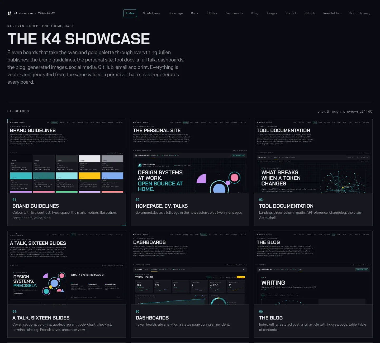
- A full showcase of the winner on every surface I publish on: site, docs, slides, dashboards, blog, images, social, GitHub, email, print. Eleven boards. That’s where I said yes.
Two things made this workable.
Boards are code. Every board is an HTML page generated by a small script next to it. When I said “less saturated” or “try the gold against eight other primaries”, a new round was minutes away, not days. There are 131 HTML boards in the repo now.
Every option is kept. Not just the winner. When I hesitated between two palettes a week later, the losing one was still there to look at next to the winner. It’s the record of the exploration, and it’s also why I trust the result: I saw what I didn’t pick.
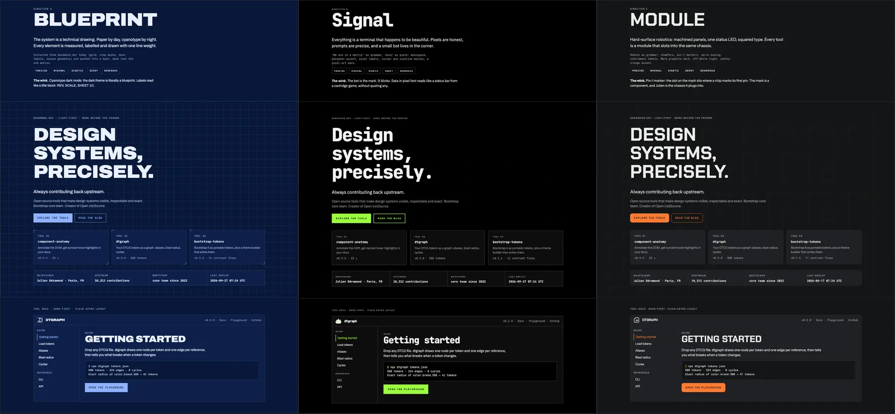
Here are the three directions from day one, in their dark versions. Same content, same brief, three personalities. I took the third as the base, with parts of the other two.
The colour rounds are where Claude was the most useful. Every round was one board, and every option on it was the same piece of UI (a docs header, buttons, badges, a row of secondary colours), so I compared palettes and nothing else. Each option came with its numbers: contrast on the field, chroma, distance from the gold in OKLab, and a sentence on how it feels.
Round 18 is the one I picked from. I had just decided two things: dark only, and the gold #FCC514 is fixed. Claude came back with eight systems built around that gold:
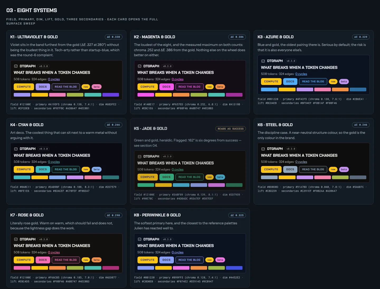
Fun fact: Claude’s written recommendation on that board was K1, ultraviolet. I picked K4, cyan. That’s the deal: it proposes and argues, I decide.
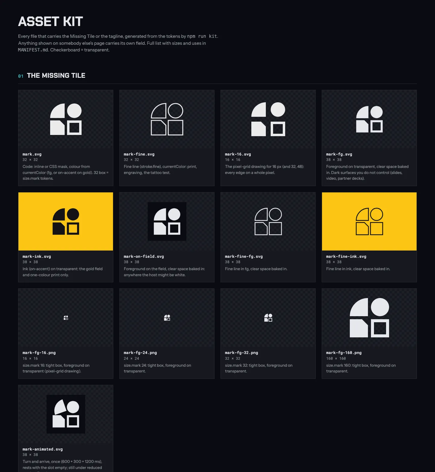
The mark went through the same process. Round 7 took my pick from the previous round, the Missing Tile (four tiles, one of them missing: the piece still to be contributed), fixed a sizing bug, and put eight variants side by side at 64, 32, 24 and 16 px, in fine line, on gold, as an avatar and in a lockup, each with its motion and its risk:
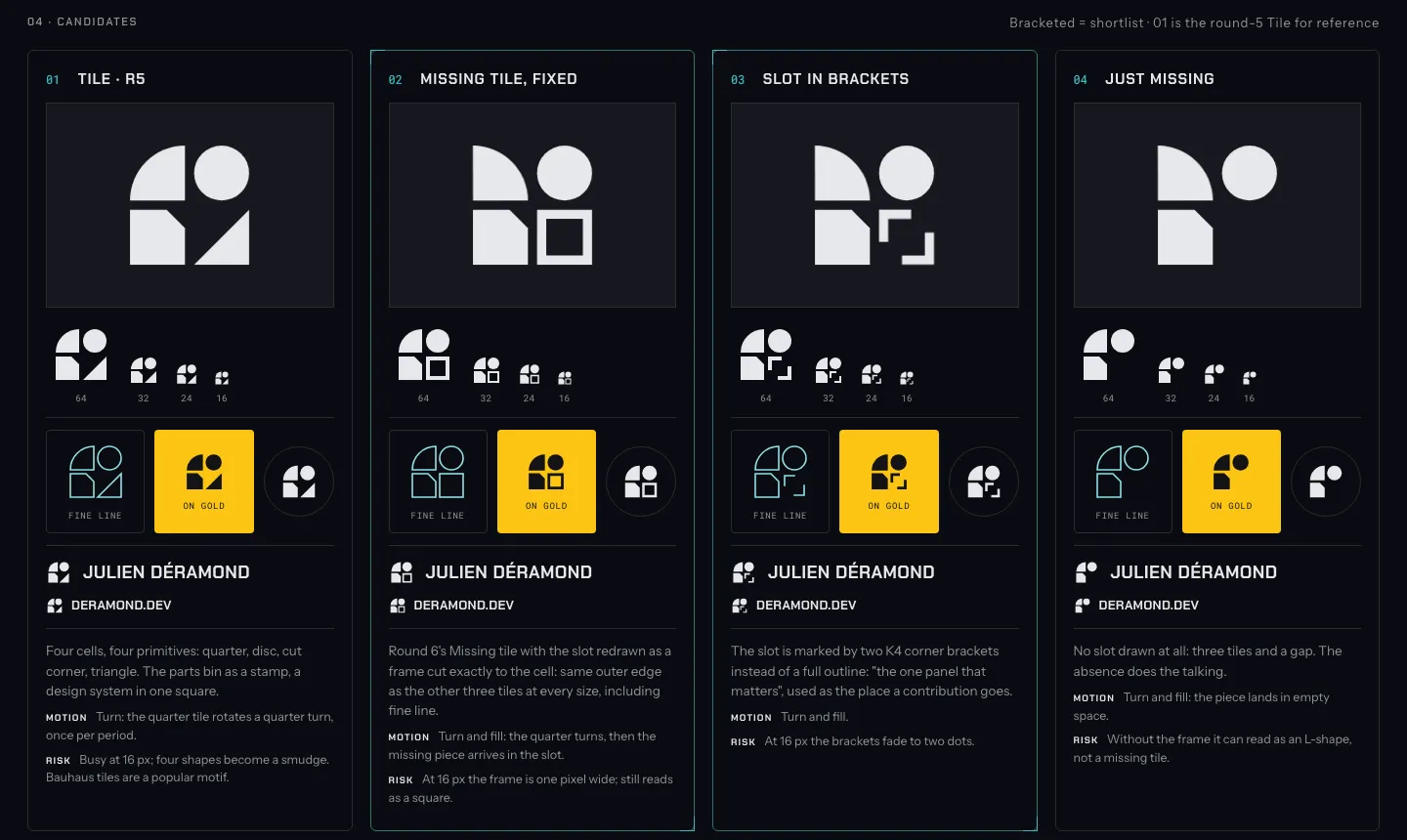
The result is “K4”: one dark field everywhere, cyan doing all the structural work, and gold spent once per decision. Chakra Petch, Instrument Sans and Roboto Mono. A mark called the Missing Tile. A tagline: Design systems at work. Open source at home.
Before saying yes, I asked for the whole thing on every surface at once. The showcase is eleven boards: guidelines, personal site, tool docs, a full talk, dashboards, blog, images, social media, GitHub, email, print. It’s much easier to judge a direction on a slide and a README than on a palette.
Is it as good as what a real designer would have made? No, and I know it. But I wouldn’t have done better on my own, and I would never have found the evenings to try. Given that, the comparison that matters isn’t “Claude vs. a designer”. It’s “Claude vs. my old mismatched stuff”.
From boards to tokens#
Once the direction was validated, the boards were frozen and the brand became a set of design tokens: the source of truth for every value.
- DTCG format (2025.10), with a resolver and two tiers: primitives and semantic tokens. One theme, dark, so the resolver resolves once.
- Terrazzo builds CSS custom properties and a JS export.
- Tests as gates.
npm testchecks the contrast of every colour pairing the brand allows, and runs dtgraph to catch reference cycles. Both fail the build. If a new colour breaks AA, it doesn’t ship.
{
  "color": {
    "bg": {
      "$value": "{palette.neutral.void}",
      "$description": "Page background."
    },
    "fg": {
      "$value": "{palette.neutral.mist}",
      "$description": "Body text."
    }
  }
}
Nothing fancy, and that’s the point: it’s exactly what I’d set up at work, just smaller.
What actually looks like a design system team’s product#
This is maybe the only phase where I was actually useful. Until the direction was validated, I was a human colour picker: look at eight palettes, point at one. From the tokens on, it was my day job. I asked for this architecture from day one, and the choices below come from years of building design systems and tools. I didn’t want “a logo and some colours”, I wanted a small product line on top of the tokens, the same kind of thing a design system team ships to product teams:
| Package | What it does |
|---|---|
@deramond.dev/tokens |
The DTCG tokens, built to CSS and JS. |
@deramond.dev/astro |
One Astro integration for docs sites and blogs: layouts, header, footer, sidebar, search, table of contents, the code theme, RSS, a generated Open Graph image per page. |
@deramond.dev/storybook |
A Storybook addon that puts the manager and the docs pages on the brand, while leaving the stories alone. |
@deramond.dev/slidev-theme |
A Slidev theme for talks, with French typography for French conferences, and 4:5 layouts for LinkedIn carousels. |
All public on npm, MIT, and all generic: no site’s name or identity is hard-coded. A site declares who it is once, in its config. This very site is:
deramond({
  site: { name: 'deramond.dev', description: SITE_DESCRIPTION },
  brand: { mark: './src/brand/mark.svg', favicons: './src/brand/favicons/' },
  nav: NAV_LINKS,
  blog: { license: 'CC BY-SA 4.0' },
  og: { art: './src/brand/og-art.png' },
});
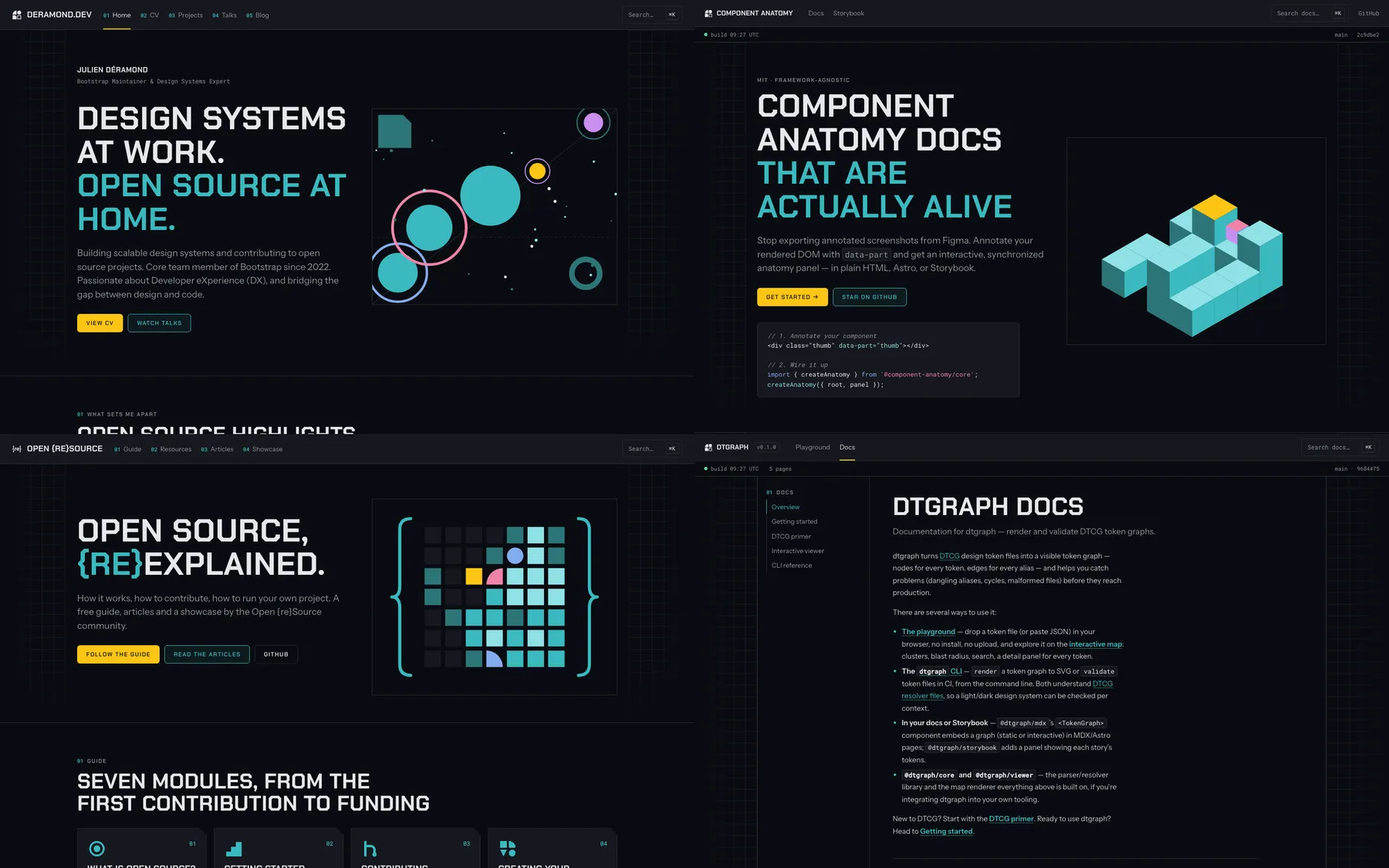
The same integration builds the docs of dtgraph, Component Anatomy and Transtyle, plus openresource.dev and adventofopensource.com, which have their own marks and palette but the same system underneath. Six sites, one package. Open {re}Source moved off Starlight and starlight-blog in the process.
Then there’s the asset kit: a generator that renders the mark, lockups, favicons and web manifests, avatars for every network (each carrying its own dark field, because GitHub and most social previews are white), README headers per tool, OG art, LinkedIn and Bluesky banners, email signatures and social post images. One command, and each project gets its own bundle of files, with a README saying where each one goes.
The packages ship code only. Pictures are generated in the private repo and committed by each site. So the brand is stored in one place, and exported per context: a CSS file for a website, a theme for Slidev, an addon for Storybook, a PNG for a README, a 4:5 image for LinkedIn.
Rollout: every change reaches every consumer#
A design system that ships a new version and never checks who uses it is how you end up with five versions in production. So the private repo keeps a list of consumers: which project uses which package version and which kit file.
When a package is released, a propagation issue opens with one checkbox per consumer, and each consumer gets its own pull request. Claude opens them; I review them; I merge them. Nothing lands in another repository without me.
And here I have an advantage no design system team in a big organisation has: I own every product that uses my design system. No other team to convince, no roadmap to fit into, no “we’ll upgrade next quarter”. Even when a release is breaking, I have all the context on both sides, so the bump is fast and efficient.
Over the eight days that meant about 80 pull requests across 11 repositories, from tool docs to my GitHub profile README to the Open {re}Source carousels repo. Mostly small, mostly boring. Boring is good.
In numbers#
| Days, first commit to everything rolled out | 8 |
| Commits in the branding repo | 261 |
| Dated decisions | 98 |
| HTML boards (every option kept) | 131 |
| Colour rounds before saying yes | 18 |
| Packages published on npm | 4 |
| Sites on the shared Astro integration | 6 |
| Pull requests in other repositories | ~80, across 11 repositories |
What worked, and what didn’t#
What worked:
- Written rules beat good prompts. The rules file and the decision log did more for quality than anything I typed in a chat. Claude stays consistent because the constraints are on disk.
- Claude proposes, I decide. I didn’t have to be creative from a blank page, I had to have opinions about options in front of me. That’s a much easier job for a non-designer.
- The backlog in issues, one action for me. It’s what made this survivable on spare time.
- Same practices as at work. Tokens, contrast in CI, versioned packages with changelogs, consumers tracked, one PR per consumer. Nothing new, just applied to a team of one.
What didn’t, or not fully:
- Taste has a ceiling. Eighteen colour rounds says more about me not knowing what I wanted than about Claude. A designer would have got there faster, and further.
- Review is the bottleneck. Eighty pull requests is eighty reviews. Claude doesn’t get tired; I do.
- It’s a first version. The direction is validated, the details per surface will keep coming. There’s a yearly review in the calendar (a workflow opens the issue every September) so the brand doesn’t rot quietly.
Why it was worth it#
I have a lot to do in open source, especially on Bootstrap, and I do it on my spare time. Rebranding everything I publish was the kind of project I’d have postponed forever, or started and abandoned halfway with three sites migrated and four not.
Here, it’s done. Every new tool I start gets the brand for free: install one package, copy one bundle, write one config. And I got my evenings back for Bootstrap.
That’s the real result. Not the colours: the time.
Now, let’s finish this Bootstrap v6 major version.